
The new Herberia Annual Catalogue 2026 is not a simple editorial update.
It is a structured project, designed to strengthen the brand’s positioning and transform the catalogue into a daily tool for work, inspiration and relationship with design.
A catalogue that does not merely collect collections, but builds a coherent narrative of identity, material culture, design and contemporary vision. A true professional tool, designed to be useful, recognisable, easy to consult and sales-oriented, without ever renouncing the symbolic and narrative value of the brand.

A new visual identity: color as a strategic choice
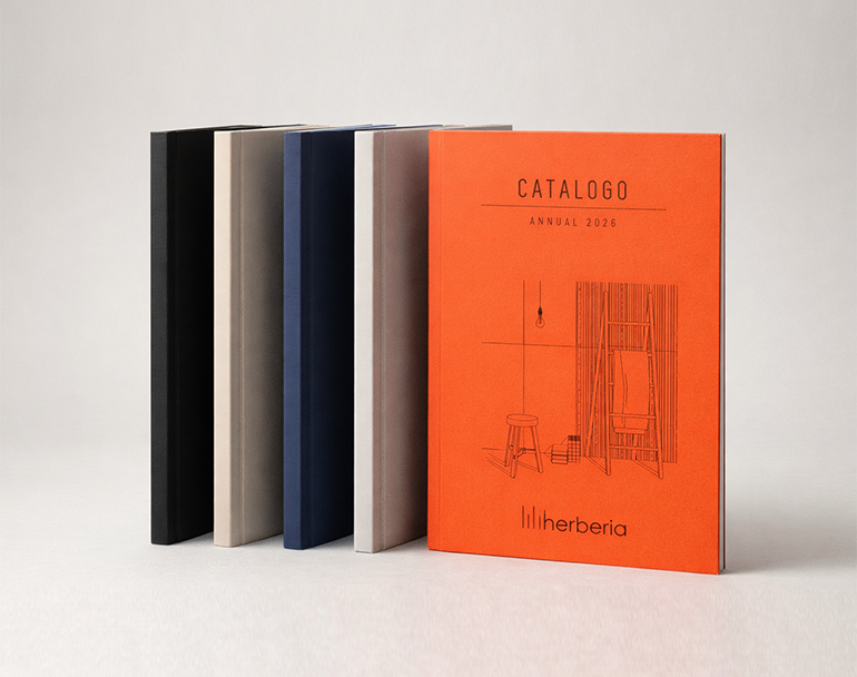
The first major transformation starts from the cover.
Herberia chooses to abandon soft-touch lamination and introduce a pigmented paper, more material and professional, consistent with a more authentic vision and more closely connected to the world of ceramic matter. But above all, it introduces a strong element of disruption: a full, bold and recognisable colour.
The chosen shade, Cotto Vivo, breaks the patterns of the ceramic panorama, traditionally dominated by neutral, minimal, often anonymous covers.
It is not an aesthetic choice for its own sake, but an identity choice. This colour:
-
guarantees immediate recognisability;
-
communicates energy and contemporaneity;
-
expresses personality and design character;
-
makes the catalogue immediately distinguishable in the competitive context.
It is a warm, saturated, modern colour. A colour that does not aim to be “trendy”, but identitarian.
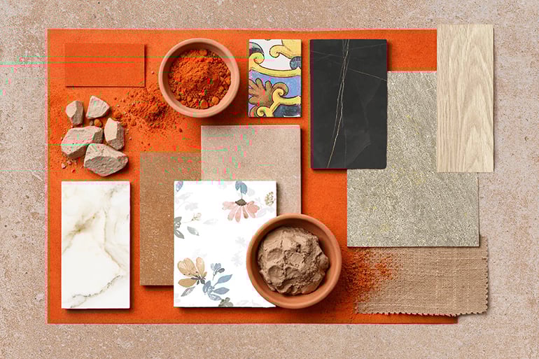
A colour that speaks of matter
Cotto Vivo is not only a graphic sign. It is a symbol. It directly recalls:
- land;
- clays;
- ceramic body;
- the warmth of processing;
- the artisanal dimension of ceramics.
It is a colour that tells a precise balance: manufacturing roots + modern spirit.
Tradition and innovation coexist, in full coherence with Herberia’s values. It is not just a cover: it is a positioning statement. A cover that does not only introduce a catalogue, but tells the story of Herberia. 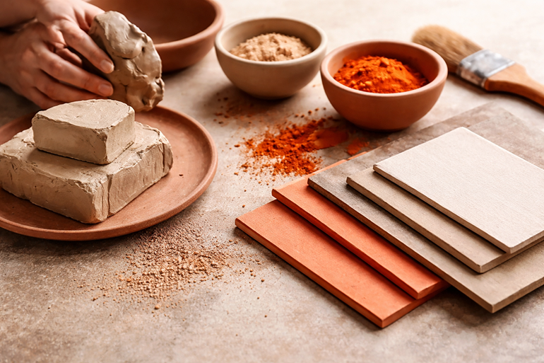
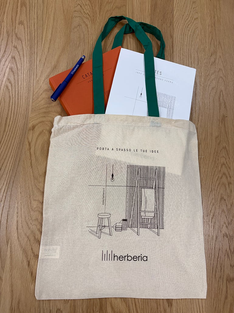
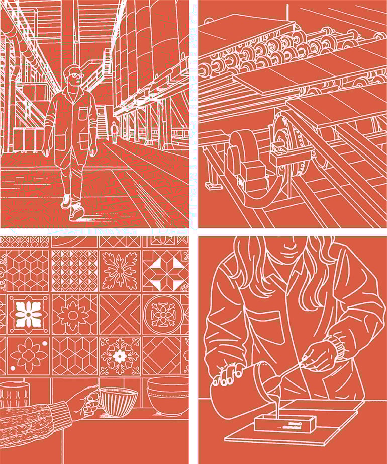
The graphic sign as a visual signature: the inhabited space
Alongside colour, a new central element enters the scene: the graphic sign. The cover introduces an essential scene: few objects, a barely suggested space.
It is not decoration. It is language. This graphic element becomes a true visual signature, immediately expressing what Herberia does: designing surfaces for inhabited spaces.
Not abstract surfaces, not isolated materials, but lived spaces, real places, environments in which everyday life moves. The graphic sign:
- creates visual continuity between cover, merchandising and communication;
- becomes a narrative thread;
- helps the reader to orient themselves;
- builds a recognisable and coherent identity across all touchpoint.
It is the transition from vision to space. From idea to environment. From project to everyday living.
A catalogue that tells a story, not only shows
The Annual Catalogue 2026 has been rethought in structure, readability and graphic coherence with a clear goal: to make the catalogue a more modern, more recognisable, easier to consult and more sales-oriented tool. But above all, to make it a narrative tool, not only a technical one. An editorial project that builds:
- identity;
- positioning;
- product culture;
- perceived value;
- brand authority.
Traditional bicottura as cultural heritage and distinctive value
One of the most significant elements of the new Annual 2026 is the inclusion of a block of pages dedicated to traditional bicottura, positioned as an interlude between porcelain stoneware and bicottura. Not a simple technical section, but a true cultural and educational space. These pages describe in a simple but authoritative way:
- the production process of bicottura;
- its technical characteristics;
- its aesthetic and application advantages.
With two strategics objectives:
- to provide agents with a clear tool to explain bicottura to showrooms and architects;
- to enhance Herberia’s ceramic tradition, highlighting its specialization and expertise.
It is a strong identity choice: in a market increasingly focused only on porcelain stoneware, Herberia reclaims bicottura as a cultural, technical and aesthetic heritage, reaffirming its design value and contemporary dignity. Not as an alternative, but as complementarity. Not as the past, but as living expertise.
An editorial project that strengthens the brand
The Annual Catalogue 2026 is born with a clear objective: to provide a more effective and more representative tool of Herberia’s identity. Every choice, from colour to paper, to graphic sign, to structure and contents, responds to a precise vision:
- to differentiate with courage;
- to communicate quality and design;
- to enhance material identity;
- to strengthen the brand’s visual positioning.
It is not just a catalogue. It is a branding project. It is a silent manifesto of identity. It is a commercial tool that speaks the language of design culture.
Discover the new Annual Catalogue 2026. Browse it, explore it, live it as a tool for work, inspiration and design.
Because it tells surfaces, but above all it tells a way of inhabiting spaces.

 Annual 2026: the new Herberia Catalogue between identity, matter and vision">
 Annual 2026: the new Herberia Catalogue between identity, matter and vision">
 Annual 2026: the new Herberia Catalogue between identity, matter and vision">